
Transform your marketing efforts with powerful data-driven strategies that not only enhance targeting but also significantly increase your return on investment.
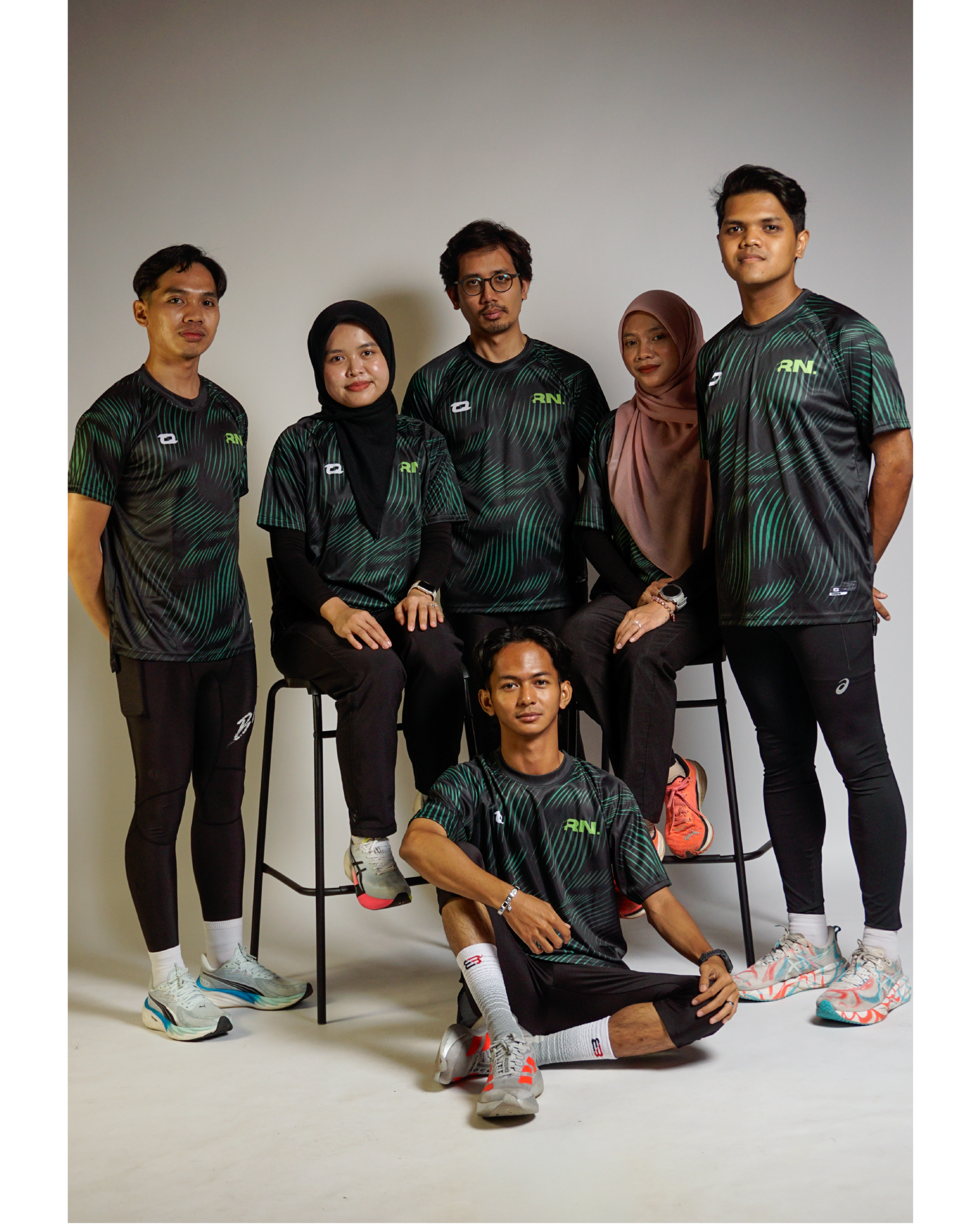
When I started designing the promotional campaign for the Runndurance Community Tee, my goal was to create more than a product announcement. I wanted to develop a visual identity that reflected the spirit of the community — a group built around consistency, shared experiences, and a collective passion for running.
The challenge was to transform a simple merchandise launch into a campaign that felt energetic, modern, and representative of the people who make Runndurance what it is today.
Establishing the Visual Direction
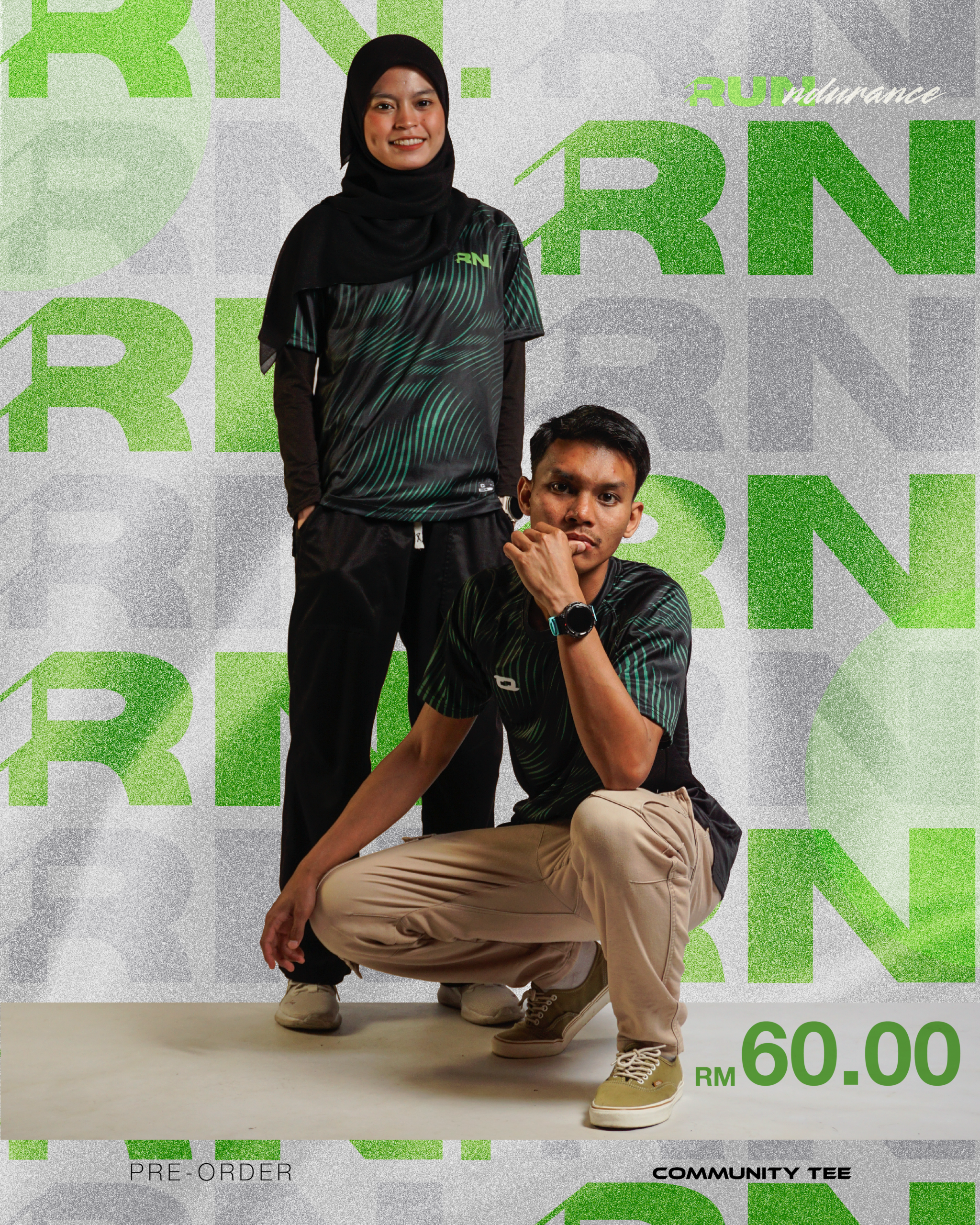
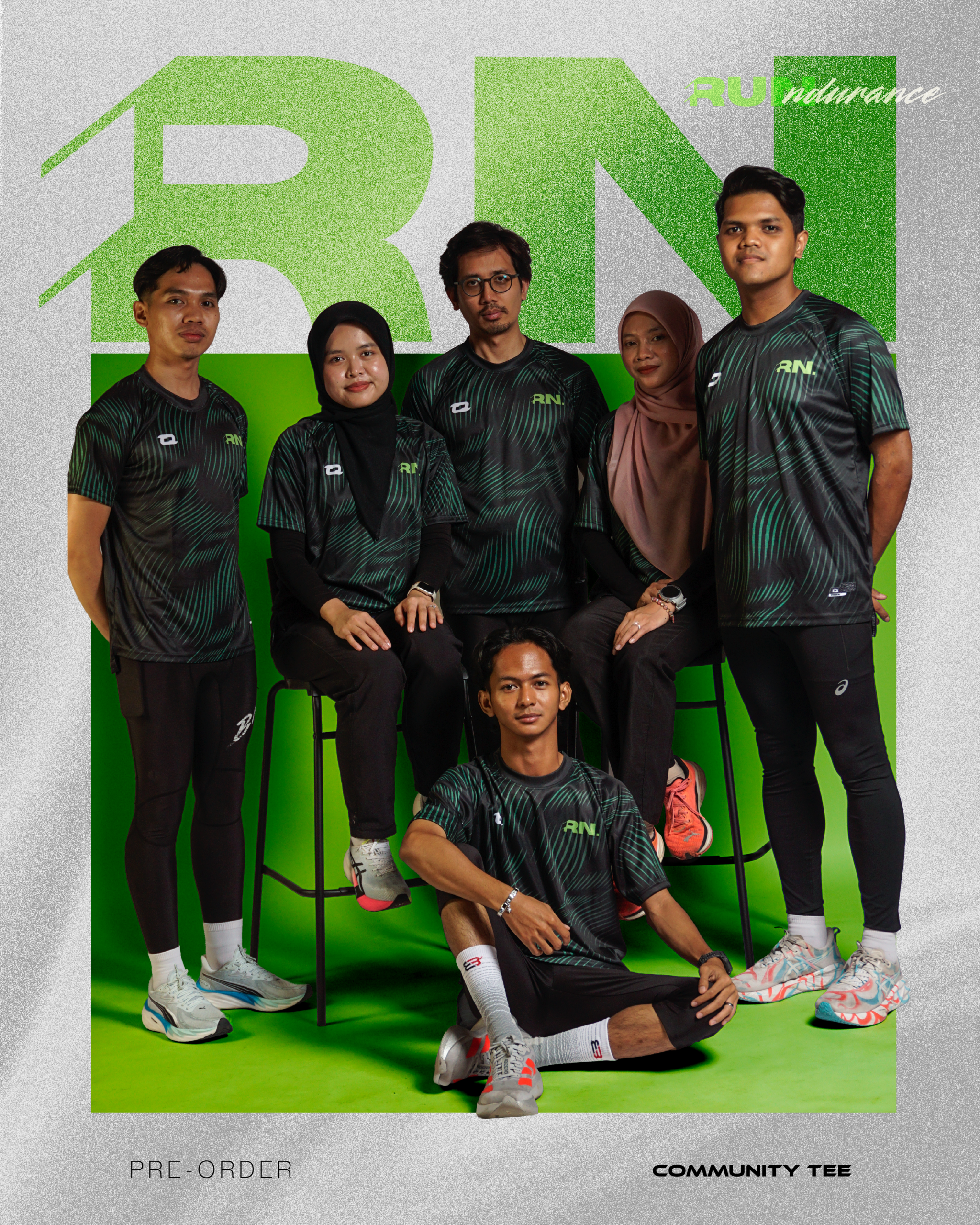
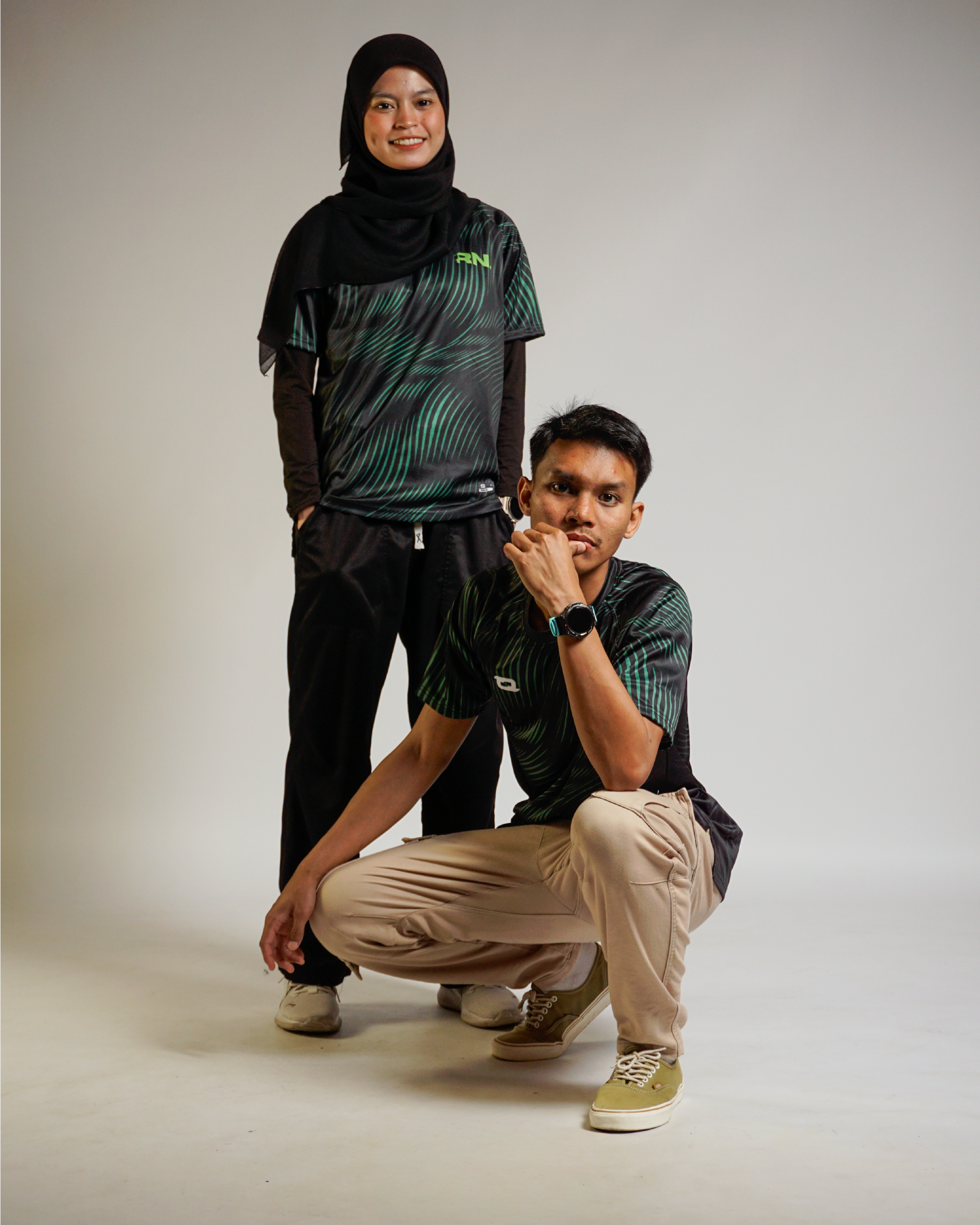
The first decision was to move away from a conventional sportswear advertisement. Instead of relying solely on product shots, I wanted the campaign to highlight the people behind the brand.
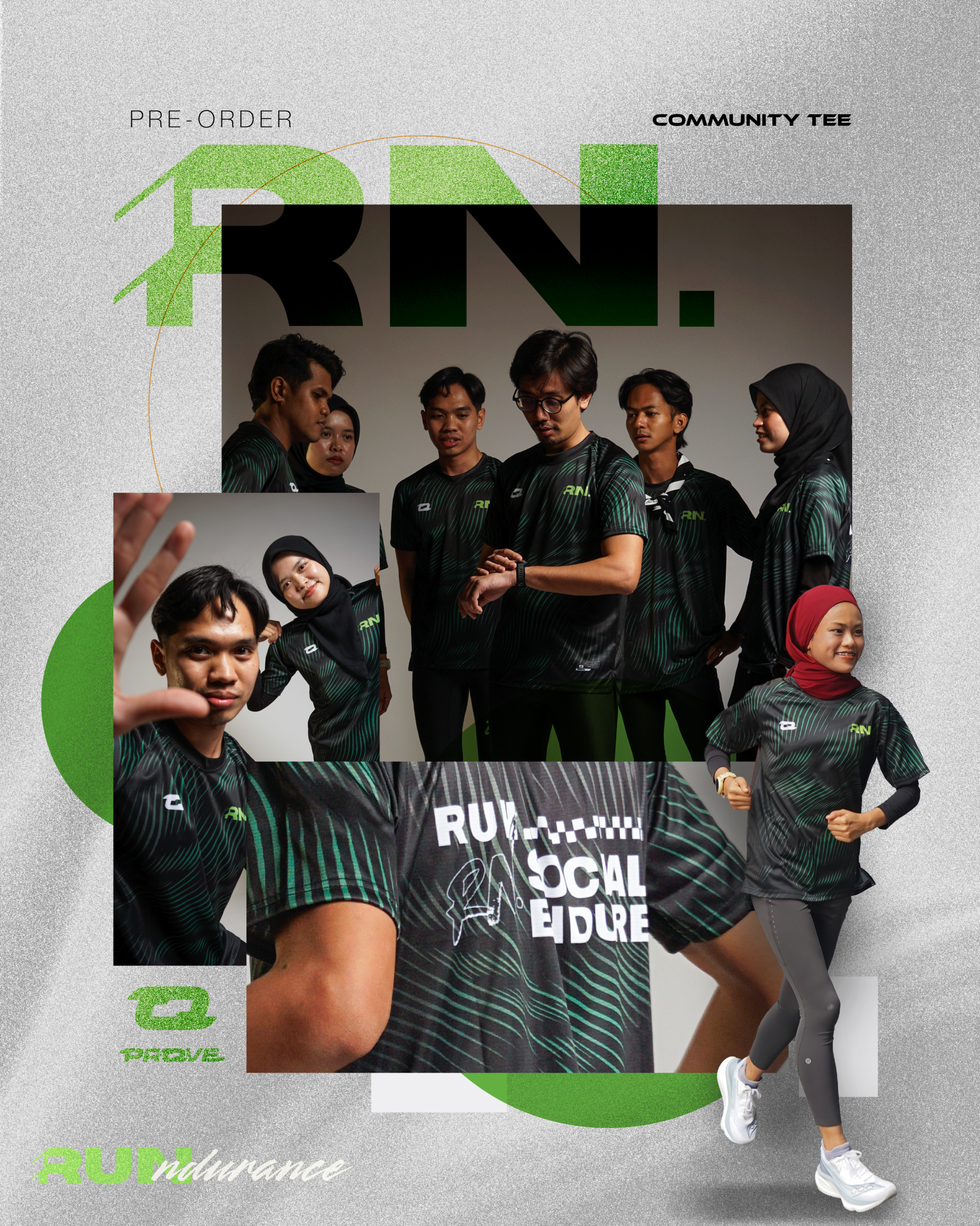
The visual direction was inspired by contemporary sportswear campaigns, combining bold typography, layered compositions, and editorial-style photography. Large-scale typography became a key element throughout the design, allowing the initials “RN” to function as both a branding device and a visual anchor.
The signature green was selected as the primary accent colour to reinforce the brand identity while creating contrast against the darker tones of the jersey.
Building Depth Through Composition
One of the most important aspects of the design process was creating depth and movement within a static format.
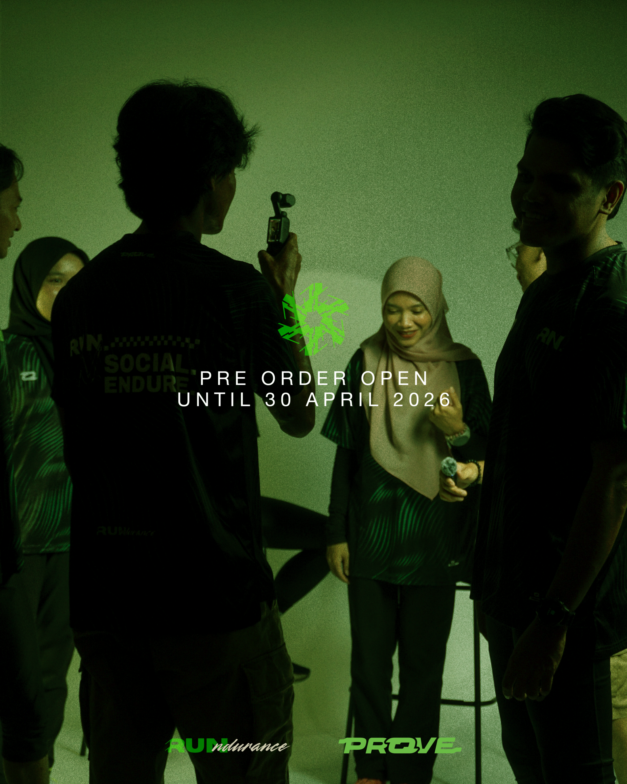
For the hero poster, multiple photographs were combined into a collage-like composition. Rather than displaying a single image, I layered group portraits, lifestyle shots, product details, and action poses into one visual system.